Blog
Stay up to date on the newest developments on Veboli and get insights into the workings behind the screen.
Years
Design 13.0
2018-04-15 13:19
It's done! I've spent a few too many hours working on the new design the last few days as I wanted to have it done before my week of hiking in Switzerland. But what a beauty!
Veboli isn't the only site on the Internets I use, and I seemed to have been collecting a lot of useful tips over the past few weeks and months. Once I started tweaking the home page when you're logged in, I saw that what I was working on wasn't just any old update. No, no, I was starting on the definitive design for Veboli!

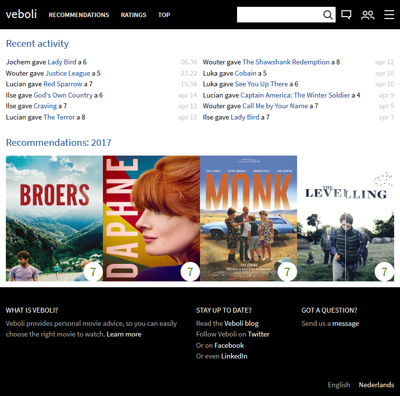
A truncated version of the home page that I started with.
Black on top and bottom, white for the content, text for the recent activity, and large posters for showing the movies.

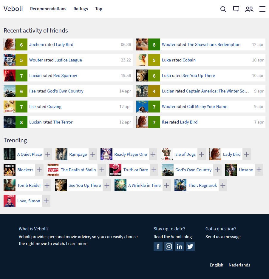
What I turned the home page into.
The first step I took was showing the movies as a horizontal bar. That makes more sense with text and provides more order when you've got a bunch of movies (like on your recommendation page). I then removed the specific recommendations and added trending movies. (Don't worry, the specific recommendations can be accessed via the recommendations menu.)
To round it of, the menu bar on top became white, the content a light shade of gray, and the bottom became a dark shade of blue which now has icons for social media (including Instagram!).
What is Veboli?
Veboli provides personal movie advice, so you can easily choose the right movie to watch. Learn more
Stay up to date?
Read the Veboli blog
Got a question?
Send us a message
English


